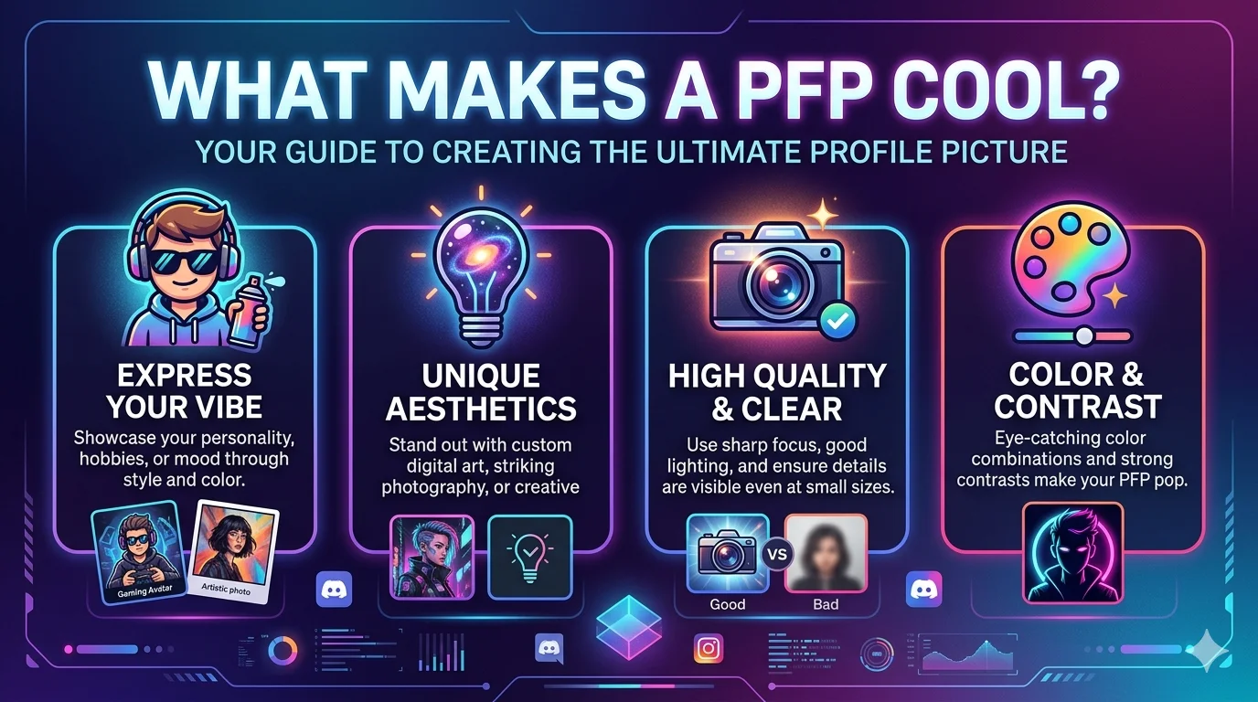
Cool PFP Ideas That Make People Actually Stop Scrolling
Your account gets judged before anyone reads a single word you wrote. A weak profile picture signals a forgettable account — no second look, no follow, no click. A cool pfp changes that calculation the instant your avatar loads. It carries your personality into every comment section, every server you join, and every search result your account appears in. One sharp image earns the attention that months of content alone cannot always guarantee.
The Invisible Work Your Cool PFP Does Around the Clock
Your avatar is the most repeated visual asset your account owns. It appears on every comment, every reply thread, every user search result, and every profile visit — long before anyone reaches your bio or your pinned post. Most creators spend enormous energy on content and almost none on the image that precedes all of it.
A storefront sign functions similarly to a cool PFP. People make a snap judgment about whether to walk inside based entirely on what they see from the street. A compelling sign earns foot traffic that a great interior alone never would. Your avatar is that sign — visible constantly, judged immediately, and carrying your entire first impression in a frame smaller than a postage stamp.
The accounts that grow most consistently on competitive platforms are almost always the ones where the avatar and the content feel like they came from the same deliberate creative vision. Mismatched or bland profile pictures create a low-trust signal that pushes people toward the back button before curiosity even has a chance to form.
Cool PFP for Boys: Styles That Communicate Without Explanation
The most effective cool pfp for boys share one quality: they communicate a clear attitude without requiring any caption or context. Attitude survives compression at small sizes. Complicated visual stories do not.
These categories deliver that clarity consistently:
- Dark silhouette character art — a single figure with a strong outline against a contrasting background, often in a limited color palette that preserves its visual weight at thumbnail dimensions
- Cinematic game or film stills — high-contrast frames where a character is frozen at a genuinely charged moment, rather than a neutral pause between actions
- Masked or helmeted figures — these carry natural mystery and communicate presence without needing facial expression to do the emotional heavy lifting
- Clean minimalist icon design — one bold shape or symbol against a solid background, which actually gains legibility as it gets smaller rather than losing it
- Abstract geometric compositions — angular color arrangements with sharp internal contrast that read as precise and intentional at any display size
The single rule that ties all of these together: one dominant subject, one clear emotional register, and nothing inside the frame competing for the viewer’s attention.
Cool PFP for Girls: Visual Identity That Actually Holds Up Over Time
A cool pfp for girls spans a wider visual range than most platform-specific guides give it credit for. The category runs from soft illustrated portraits to sharp dark character art — and every point along that spectrum has a real audience actively looking for exactly that style.
What separates the cool pfp for girls choices that earn follows from the ones that get scrolled past is not the specific style. It is whether the image feels chosen rather than uploaded. Viewers register that difference immediately, even when they cannot articulate what triggered the distinction.
Styles that build genuine account recognition over time:
- Digital illustrated portraits — character art where the expression communicates something specific and deliberate rather than something neutral or decorative
- Soft color-graded photography — pastel or warm-toned portrait crops that carry an emotional quality without veering into oversaturated territory
- Vintage film-grain edits — images processed to feel tactile and warm, with a visual texture that stands out cleanly against the flat digital aesthetics that dominate most feeds
- Fantasy and celestial character art — otherworldly illustrated figures that place the account in a clear creative universe without requiring any explanation
- Confident close-crop portraits — real or illustrated faces where the expression is intentional and the color treatment reinforces rather than fights the mood
Every one of these succeeds for the same reason: the image communicates that someone made a deliberate choice, and deliberate choices earn trust faster than random ones.
Cool PFP Aesthetic: How to Build Visual Identity That Outlasts Every Trend
A cool pfp aesthetic is not a single image decision — it is a commitment to a visual language that makes your account instantly recognizable the moment someone encounters it anywhere your name appears online.
The most durable aesthetic choices are anchored to a feeling rather than a specific trend cycle. Trends shift with seasons. Feelings do not expire. An avatar built around quiet confidence, controlled intensity, or dreamlike detachment holds its power long after the particular trend that inspired it has moved on and been replaced by something newer.
Core aesthetic directions worth understanding before you choose:
- Minimalist — maximum open space, one precise focal point, muted or monochromatic color palette that communicates taste through restraint
- Cyberpunk and neon — high-saturation electric colors against near-black backgrounds, futuristic design language that signals tech-forward creative energy
- Dark academia — warm brown undertones, vintage illustration references, a visual texture that connects to literature and classical academic imagery
- Soft grunge — faded color, intentional imperfection, a worn aesthetic that communicates authenticity over polish
- Y2K revival — chrome surface textures, early 2000s color memory, and bold graphic type used as a visual element rather than just information
Choose based on how your content actually feels to interact with — not based on which aesthetic looks most impressive in isolation. Alignment between avatar and content is what creates the recognition loop that brings people back to your profile repeatedly.
Dark Cool PFP: Why Low-Light Avatars Build the Sharpest First Impressions
A dark cool pfp is not a moody choice — it is a strategic one. Dark imagery communicates depth and intentionality faster than most bright alternatives, especially on platforms that operate with dark-mode interfaces as their primary or secondary display environment.
YouTube, X/Twitter, and Discord all use dark UI themes by default or strongly prefer them. A dark cool pfp sits cleanly in those environments without fighting the surrounding UI for visual space. The avatar does not disappear — it anchors itself against the interface and holds attention precisely because it belongs there.
What actually makes a dark cool pfp work rather than just feel flat:
- Strong internal contrast — a light subject or lit element against dark surroundings, so the darkness frames rather than buries the focal point
- A single clear point of visual focus — one face, one figure, one illuminated object — that the surrounding dark pushes forward instead of competing with
- One color accent used deliberately — a single saturated tone (deep red, cold blue, electric purple) pulled against near-black gives the image energy without complexity
- Sharp edge definition on the primary subject — blurry dark images read as failed uploads, not artistic choices
Shadow-wrapped character portraits, night-scene cinematic stills, starfield compositions, and high-contrast illustrated figures with dramatic lighting all perform well within this framework. The darkness needs to be doing something active — framing, directing attention, building atmosphere — rather than simply occupying space.
Cool PFP for TikTok: What the Platform’s Visual Culture Actually Rewards
Compared to other major social media platforms, TikTok analyzes viewer judgment more quickly. Following decisions happen in fractions of a second based partly on what the profile picture communicates about the account’s energy and identity. A cool pfp for TikTok carries that signal visibly — or it fails to carry it at all.
TikTok’s default interface background is white. That single fact should shape every avatar decision made specifically for the platform. Images with dark or muted tones that read beautifully on Discord or X can completely vanish against TikTok’s bright layout. High visual contrast and color boldness are not stylistic preferences here — they are functional requirements for the avatar to exist as a readable object.
What performs consistently as a cool pfp for TikTok:
- Expressive faces with instantaneous emotional readability, such as sincere happiness, intense focus, a composed demeanor, or purposeful mystery that draws
- Illustrated characters with saturated, bold, forward-energy color palettes
- Strongly directed light with a high subject-to-background contrast is used for portrait photography.
- Images where one dominant color “pops” cleanly against the white platform background
- Subjects with no unnecessary dead space around the edges that occupy at least 75% of the circular display area
Keeping the same cool pfp for TikTok consistently across an active content period builds viewer familiarity that compounds quietly over time. Repeat viewers begin associating that avatar with content quality — a recognition advantage that a constantly-changing profile picture never builds.
Cool PFP Ideas That Perform on Every Platform at Once
Platform-specific optimization is smart for creators who live primarily in one environment. But many people need one cool pfp that holds up everywhere simultaneously without being tuned exclusively for any single interface. These innovative PFP concepts are based on visual principles independent of platform context.
The Isolated Subject on Clean Background One face or character against a clear, uncluttered background with nothing inside the frame vying for viewers’ attention. Because the subject can read at any size and on any interface color without the surrounding space’s context altering what it says, this works everywhere.
The Monochrome Expression A single face or figure rendered in strict black and white. Monochrome cuts cleanly through interface noise on every platform and signals artistic intentionality without requiring any shared cultural context between the creator and the viewer.
The Meaningful Symbolic Icon A personally significant symbol, illustrated mark, or custom icon that represents the account’s creative identity or content area. These function as recognizable branding — distinctive enough to be identified across platforms and simple enough to read clearly at 32 pixels.
The Cinematic Quality Crop A film-still-quality composition — high production value, deliberate framing, strong emotional character — either from original photography or a well-chosen illustrated source. This reads as “this account takes its craft seriously” on every platform it appears on.
The Graphic Color Block A clean geometric composition using 2–3 bold colors in a deliberate arrangement. These gain clarity at small sizes rather than losing it, which makes them one of the most technically reliable cool pfp ideas for creators who want consistency across platforms with very different display environments.
Complete Platform Breakdown: Choosing Your Cool PFP by Environment
| Platform | Best Cool PFP Style | Ideal Format | Upload Resolution | Display Shape | Key Mistake to Avoid |
|---|---|---|---|---|---|
| Discord | Dark character art, high-contrast cool expressions | PNG | 1024×1024 px | Circle | Dark background with no contrast element disappears in dark mode |
| TikTok | Bold color, expressive face, white-contrast-ready | JPG / PNG | 200×200 px minimum | Circle | Low-contrast images vanish against TikTok’s white interface |
| Color-graded portrait, aesthetic-forward photography | JPG | 320×320 px | Circle | Overly detailed images compress into visual noise at display size | |
| X / Twitter | Iconic, dry, or high-contrast character image | PNG | 400×400 px | Circle | Text placed inside image becomes unreadable at avatar scale |
| YouTube | Personality-forward face or channel-branded symbol | PNG | 800×800 px | Circle | Inconsistency between avatar and channel art banner |
| Niche-specific, community-matching cool imagery | PNG | 256×256 px | Circle | Generic content signals no community awareness or belonging | |
| Warm-toned, aesthetic-forward illustrative image | JPG | 165×165 px | Circle | Dark avatars read as inactive against Pinterest’s bright UI | |
| Snapchat | Character-based, expressive, or Bitmoji-adjacent | PNG | 320×320 px | Circle | Stock imagery with no personality communicates nothing useful |
| Twitch | Gaming-adjacent cool aesthetic or streamer branding | PNG | 256×256 px | Circle | Busy backgrounds compete visually with stream panel design |
The Visual Psychology Behind Cool Profile Pictures That Earn Clicks
Choosing a profile picture is not a purely aesthetic decision — it is a trust signal and an interest signal that viewers process before they make any conscious choice to engage. Understanding that mechanism leads to better avatar choices than following trend roundups alone.
Human brains process faces faster than any other visual category. A character with a clear, readable expression triggers an immediate emotional response — recognition, curiosity, or connection — that opens or closes the door to further engagement within the first glance. Images that communicate competence and intention — clean composition, deliberate style, quality execution — extend that impression outward to the content behind the avatar.
If the profile picture looks considered, viewers assume the content is considered too. That perception advantage costs nothing to create but consistently produces better first-impression outcomes than well-written bios or polished pinned posts that only get read by people who already decided to stay.
A cool pfp built with this understanding is not just something that looks good. It is psychologically optimized for the exact invisible job your avatar is doing every hour your account is online.
Build Your Own Cool PFP Without Any Design Experience
Creating an original cool pfp from scratch is genuinely accessible now in ways it simply was not a few years ago. The tools that handle the technically difficult parts have improved enough that design experience is no longer a barrier — just a starting concept and ten focused minutes.
The process that actually produces results:
Start by choosing one word that captures the exact feeling you want the image to communicate. Sharp. Soft. Dark. Warm. Bold. Quiet. That single word acts as a filter for every decision that follows and prevents the creative process from pulling in five directions at once.
Pull a base image — your own photography, a licensed image from Unsplash or Pexels, or a downloaded illustration. High contrast between the subject and the background matters more than any other single quality at this stage.
Use Remove.bg to isolate your subject if the original background works against the aesthetic you are building. Bring the isolated image into Canva or Adobe Express and apply one deliberate treatment — a duotone color grade, a graphic frame, a single bold text element, or a clean solid background swap.
Export at the highest resolution the target platform accepts. Then — before setting anything live — view the final result at actual avatar display size on your device. Most people skip this step and discover the problem only after the upload is already live.
Tools that handle this process without requiring a design background:
- Canva (canva.com) — free templates, photo editing, background removal, and export formatting in a single browser-based tool
- Adobe Express (adobe.com/express) — professional-quality filters and graphic design options on a fully usable free plan
- Photopea (photopea.com) — complete Photoshop-equivalent editing capability in a browser with no download or subscription required
- Remove.bg (remove.bg) — accurate automatic background removal completed in under ten seconds
- CapCut (capcut.com) — strong for animated effects and motion additions on platforms that accept GIF or video avatars
Mistakes That Quietly Kill a Great Cool PFP Before Anyone Sees It
Knowing what works is only half of the equation. The other half is recognizing exactly what undoes good image choices before the avatar ever earns its first impression.
Choosing visual complexity over clarity. A richly detailed image at full resolution collapses into unreadable visual noise at 64 pixels. The cleaner and bolder the composition, the more of its cool pfp quality survives what every platform does to it upon upload.
Ignoring the platform background color. A dark avatar on a platform with a white default interface — or a pale avatar on a dark-mode platform — can make the image functionally invisible. Always test on the actual platform environment before finalizing the choice.
Using the wrong compositional framing for circular crops. Every major platform displays avatars as circles. An image composed for a square or rectangular frame will often crop the most important element — a face, an expression, the subject’s focal point — out of the circular display entirely. Center the primary subject and leave deliberate margin space around all four edges.
Picking what is trending rather than what is accurate. An avatar chosen entirely because it is currently popular — and not because it genuinely matches the account’s identity — creates a mismatch that viewers feel even when they cannot name it. A cool pfp that reflects who you actually are earns more consistent recognition over time than one chosen for trend alignment alone.
Setting it once and never revisiting it. An avatar unchanged for 18 months signals an account in the same static condition. Refreshing your cool pfp after strong growth, at the start of a new content direction, or when the previous choice has genuinely run its course keeps your profile communicating activity and forward momentum.
Match Your Cool PFP to the Personality You Actually Bring
An avatar that conflicts with how you genuinely communicate online creates a quiet credibility gap that visitors feel before they can name it. They build an expectation from the visual — and when the content or communication style does not match it, the disconnection registers immediately.
Dry, observational, and understated: Minimal is the right direction. Cool-toned, precise, low-detail imagery that communicates taste through restraint rather than energy through boldness.
High energy and visibly enthusiastic: A bold, saturated, expressive image carries that frequency before you say a word. Characters mid-action, bright dominant color, forward visual movement that reads as dynamic rather than passive.
Niche-specific creative content: Pull visual language directly from the niche itself. A gaming account with a cinematic character avatar. An art account with an illustrated portrait. A music-focused account with a clean, music-adjacent cool aesthetic that signals the space immediately.
Active across multiple communities: Anchor to something abstract but powerful — a strong monochrome portrait or a clean symbolic image that carries presence without signaling any single community’s specific visual language too exclusively.
6 FAQs — Direct Answers to the Questions People Actually Search
Q1: What makes a cool pfp different from just any attractive image?
A cool pfp is built specifically for how profile pictures are actually displayed — at small sizes, in circular crops, against specific platform interface colors. An attractive image that was not designed with those constraints in mind often reads as blurry or confusing once a platform compresses and reshapes it. A cool pfp holds its visual impact and communicates clearly regardless of the display size it ends up at.
Q2: Which cool pfp aesthetic genuinely lasts the longest before feeling dated?
Aesthetics anchored to timeless emotional registers — rather than specific trend moments — hold up the longest. Minimalism, dark character art, and monochrome portraiture all fall into this category because they communicate through composition and mood alone, which does not carry an expiration date the way meme-adjacent or trend-specific imagery does.
Q3: What is the best cool pfp for boys that reads strong at thumbnail size?
Dark character silhouettes, masked or armored figures, and high-contrast minimal compositions all communicate strength without depending on fine visual detail. The image needs to read the same way at 32 pixels as it does at full resolution — which means one dominant subject, strong contrast between subject and background, and zero competing visual elements inside the frame.
Q4: Should a cool pfp for TikTok be different from what you use on other platforms?
It often should be. TikTok’s white interface demands higher visual contrast than dark-mode platforms like Discord or X. An avatar built for a dark interface may completely disappear against TikTok’s bright background. Maintaining separate platform-optimized avatars is a reasonable strategy for any creator active across multiple environments simultaneously.
Q5: Are dark cool pfp choices right for every type of account?
Dark avatars perform strongly for gaming, music, creative writing, art, and general lifestyle accounts. They tend to create friction on platforms or within communities built around bright, warm, or professionally clean visual identities — such as educational content spaces, wellness communities, or business-forward professional profiles. The core question is always whether the dark visual actually matches the account’s content and the culture of the community it operates in.
Q6: Can someone with zero design experience create strong cool pfp ideas from scratch?
Yes — Canva’s free plan covers the entire process without requiring any prior design knowledge. Starting from a high-contrast base image and applying one deliberate treatment — a duotone color grade, a graphic frame, a clean subject isolation against a solid background — produces a result that looks original and intentional. The process takes under ten minutes once the right base image is in hand.
One Image Carries More Than You Think — Make It Deliberate
A cool pfp carries your account’s first impression across every surface where your name appears online. It loads before your bio. It shows before your content plays. It lands in someone’s awareness before they read a single thing you wrote. Treating it as a finishing touch is the most common and most costly mistake creators make when they are building an audience from the ground up.
Use the platform breakdown table to make the technically right choice for the environment where you are most visible. Test at actual display size before setting anything live — the 30 seconds that step takes has saved more strong avatars from bad compression than any other habit. Choose something that reflects your genuine creative identity rather than whatever trend is circling the internet this particular week. And revisit your choice every few months, because an avatar that grows alongside your account communicates far more than one set years ago and never reconsidered.
Pick deliberately. Set it with full confidence. Let your cool pfp do exactly what it was chosen to do.