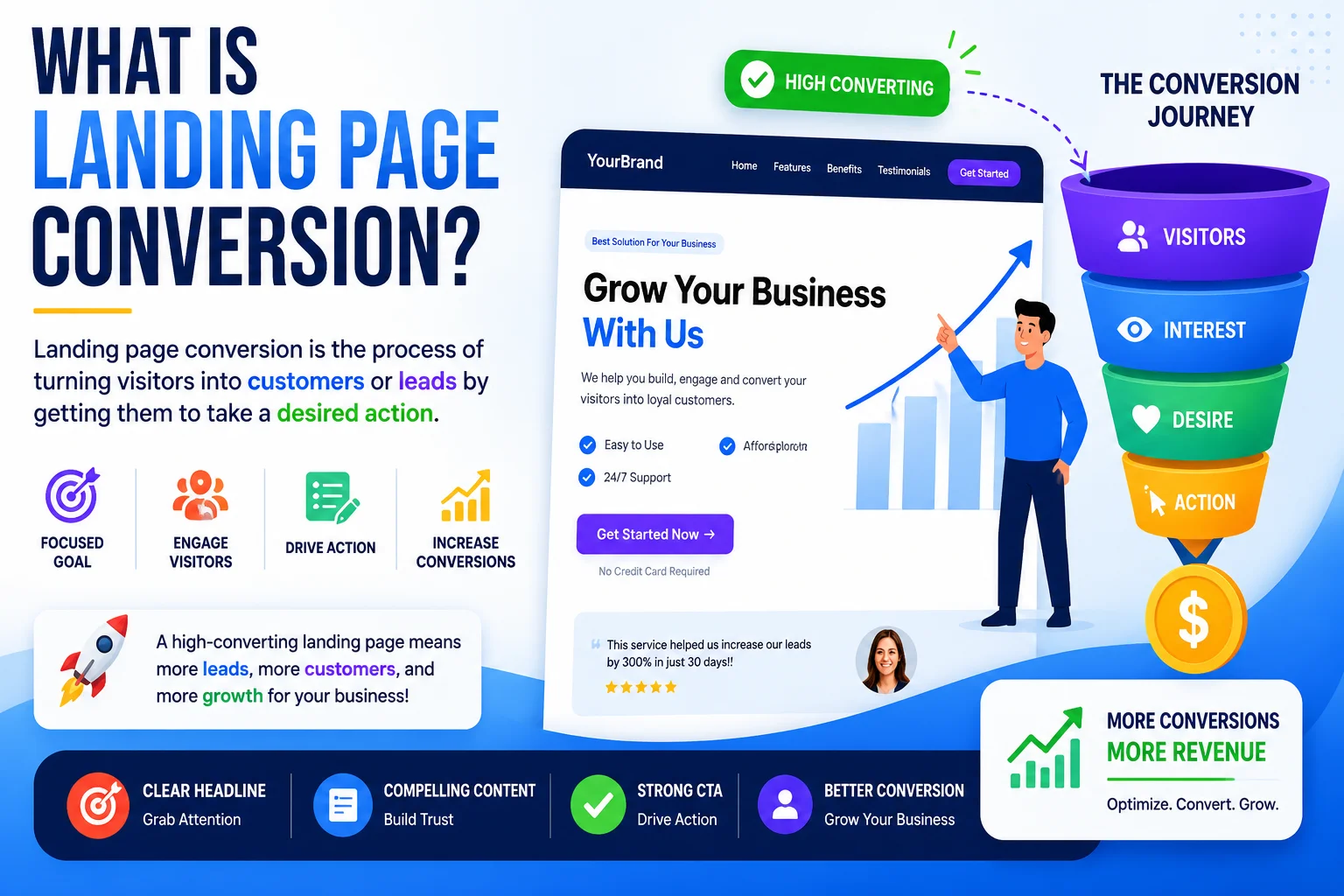
What Is a Landing Page Conversion? Complete Guide
Introduction
You are spending money on ads. Traffic is coming in. But the sales? Silence. This is one of the most common and costly problems in digital marketing. The root cause is almost always the same — your page is not converting visitors into customers.
Understanding what a landing page conversion is, and how to optimize for it, is the fastest way to make your existing traffic more profitable. No extra ad budget required.
What a Landing Page Conversion Actually Means
When a visitor completes the precise action your page was intended to encourage, a landing page conversion occurs. This could be making a purchase, taking advantage of a deal, subscribing to a newsletter, or scheduling a call. The conversion occurs at that point in time.
What separates a landing page from a regular website page is its singular focus. A homepage invites exploration. A landing page has one job — guide the visitor toward one outcome. Everything else is a distraction.
Why Traffic Alone Means Nothing
General website visitors browse. They click around, read a few lines, and leave. That is normal behavior. But when someone clicks your ad, they arrive with a specific intent. They expect a solution to the problem your ad promised to solve.
If your landing page does not deliver that solution immediately and clearly, they leave. High traffic with a low conversion rate is not a marketing win. It is money being thrown at an unoptimized process. The metric that matters is actions taken, not pages viewed.
The Power of a Single Clear Goal
Asking visitors to do multiple things at once almost guarantees they will do nothing. Subscribe and buy and share and follow — that is a recipe for paralysis.
Effective landing pages are ruthlessly focused. One offer. One call to action. No navigation bar pulling visitors away. No sidebar links. Every word, image, and button exists to support a single conversion goal.
Removing your navigation menu from landing pages alone can increase conversions by 10 to 25 percent because it eliminates exit routes.
Key Elements That Drive Results
A consistent set of construction pieces is shared by high-converting pages.
Headline that matches the ad: If your ad promised a specific result, your headline should echo that promise. Any disconnect between the ad and the page creates doubt and increases bounce rates.
Clear benefit-driven subheadline: Follow the headline with a concrete statement of what the visitor gains. Features tell. Benefits sell.
Visuals that demonstrate value: High-quality images or short videos showing the product in use reduce uncertainty and build desire. Avoid generic stock photography.
Trust signals: Security badges, verified customer counts, media logos, and money-back guarantees all reduce the perceived risk of taking action.
Social proof: Real reviews, star ratings, and results from actual customers. Covered in depth below.
A single unmissable CTA button: Large, contrasting color, action-driven label.
Crafting a CTA That Actually Converts
The conversion occurs or does not occur at your call-to-action button. More attention should be paid to it than to nearly every other aspect of the page.
Generic labels like Submit or Click Here are missed opportunities. They do not tell the visitor what they are getting. Use action-oriented, value-specific alternatives instead.
Instead of Submit, use: Get My Free Marketing Guide Instead of Click Here, use: Start My 14-Day Free Trial Instead of Sign Up, use: Create My Free Account in 30 Seconds
The button should be visually dominant — large enough to command attention, in a color that contrasts with the page background. Add a brief line of reassurance beneath it such as No credit card required or Cancel anytime to remove the last objection before the click.
Design Principles for Higher Conversions
Design shapes behavior. A cluttered and confusing layout erodes confidence and drives visitors away. A clean and purposeful layout guides the eye naturally toward the CTA.
Use white space deliberately. Empty space is not wasted space. It reduces cognitive load and makes key elements stand out. The best-converting pages often feel almost sparse compared to typical websites.
Establish visual hierarchy. Use font size, weight, and color to signal what matters most. The visitor’s eye should travel from headline to key benefit to CTA. If that path is not clear within three seconds, the design needs work.
Be consistent across devices. A beautiful desktop layout that breaks on tablet destroys credibility. Test every element across screen sizes. Consistency signals professionalism and professionalism builds trust.
Mobile Optimization Is Non-Negotiable
Currently, almost 60% of all web traffic comes from mobile devices. If your landing page is not mobile-friendly, you are actively losing nearly half of your potential conversions.
Mobile optimization means text is readable without zooming, buttons are large enough to tap comfortably, forms have as few fields as possible, and page load time is under three seconds. Google also uses mobile-friendliness as a ranking signal, so poor mobile performance hurts your organic visibility too.
Mobile checklist:
- Text readable at 16px minimum
- CTA button at least 48px tall
- No horizontal scrolling
- Load time under 3 seconds
- Forms with 3 fields or fewer
Building Trust with Social Proof
People follow the behavior of others, especially when making a decision under uncertainty. Social proof is the mechanism that makes this work in your favor.
Customer reviews with real names and photos: A genuine photo and first name transforms a quote from generic to believable. Video testimonials are even more powerful.
Usage numbers: Trusted by 12,000 business owners provides immediate scale and credibility.
Case studies and results: Specific measurable outcomes such as increased revenue by 43 percent in 60 days outperform vague praise every time.
Media mentions: Even if readers never read the articles, logos from reputable sources swiftly convey legitimacy..
The key is specificity. Vague testimonials like Great product are nearly worthless. Specific outcome-driven proof with real details tips undecided visitors from browsing to buying.
How to Calculate Your Conversion Rate
Improvement requires measurement. Your conversion rate tells you exactly how effectively your page is turning visitors into customers.
Formula: Conversion Rate = (Conversions divided by Total Visitors) multiplied by 100
If 200 people visit your page and 8 complete your goal, your conversion rate is 4 percent. Industry averages sit between 2 and 5 percent, but top-performing pages regularly exceed 10 percent.
Track this number consistently. Moving from 2 percent to 4 percent doubles the revenue from the same ad spend without changing a single campaign setting.
Here are 8 SEO-optimized FAQs targeting Google’s People Also Ask section:
FAQs — What Is a Landing Page Conversion?
Q1. What is a landing page conversion?
A landing page conversion occurs when a visitor completes the specific action your page was built to drive — such as making a purchase, signing up for a newsletter, booking a call, or claiming an offer. It is the measurable moment when a passive visitor becomes an active lead or customer.
Q2. What is a good landing page conversion rate?
The average landing page conversion rate across industries is between 2 and 5 percent. A rate above 10 percent is considered high-performing. However, a good conversion rate depends on your industry, offer type, and traffic source. Focus on consistently improving your own baseline rather than chasing a universal number.
Q3. What is the difference between a landing page and a website?
A website serves multiple purposes — it informs, educates, and allows visitors to exploreConversion is the only goal of a landing page. It eliminates sidebars, navigation menus, and distracting links, leaving the visitor with just one sensible option. Landing pages are far more effective for paid campaigns because of this targeted layout.
Q4. Why is my landing page getting traffic but no conversions?
The most common reasons are a weak headline that does not match your ad, a vague call-to-action button, lack of trust signals like reviews or guarantees, a cluttered design, or slow page load speed on mobile. Each of these creates friction that stops visitors from taking action. Fixing even one of these issues can significantly lift your conversion rate.
Q5. How do I increase my landing page conversion rate?
The most effective ways to increase conversions are writing a benefit-driven headline, using a single clear call to action, adding genuine customer testimonials, removing unnecessary navigation links, optimizing for mobile devices, and reducing form fields to the minimum required. Running A/B tests on your headline and CTA button consistently produces the highest improvements.
Q6. What is the appropriate number of CTAs for a landing page?
A landing page should have one primary call to action. You can repeat the same CTA button in multiple places on the page — for example at the top, middle, and bottom — but they should all lead to the same action. Multiple different CTAs split the visitor’s attention and reduce the chance they complete any of them.
Q7. Does page speed affect landing page conversions?
Yes, significantly. Research shows that a one-second delay in page load time can reduce conversions by up to 7 percent. Visitors on mobile are especially sensitive to slow load times. Compressing images, reducing unnecessary scripts, and using fast hosting are the quickest ways to improve page speed and protect your conversion rate.
Q8. What does landing page A/B testing entail?
A/B testing means creating two versions of your landing page with one element changed — such as the headline, CTA button color, or hero image — and splitting your traffic between them to see which version converts better. It removes guesswork from optimization and lets real visitor behavior guide your decisions. Even small changes discovered through A/B testing can compound into significant revenue gains over time.
Conclusion
A landing page conversion is the moment a visitor becomes a lead, a customer, or a subscriber. Getting more of these moments does not require more traffic. It requires a clearer headline, a sharper CTA, better social proof, and a design that guides rather than distracts. Optimize these elements and the same traffic starts generating meaningfully different results.